Designing the first commitment
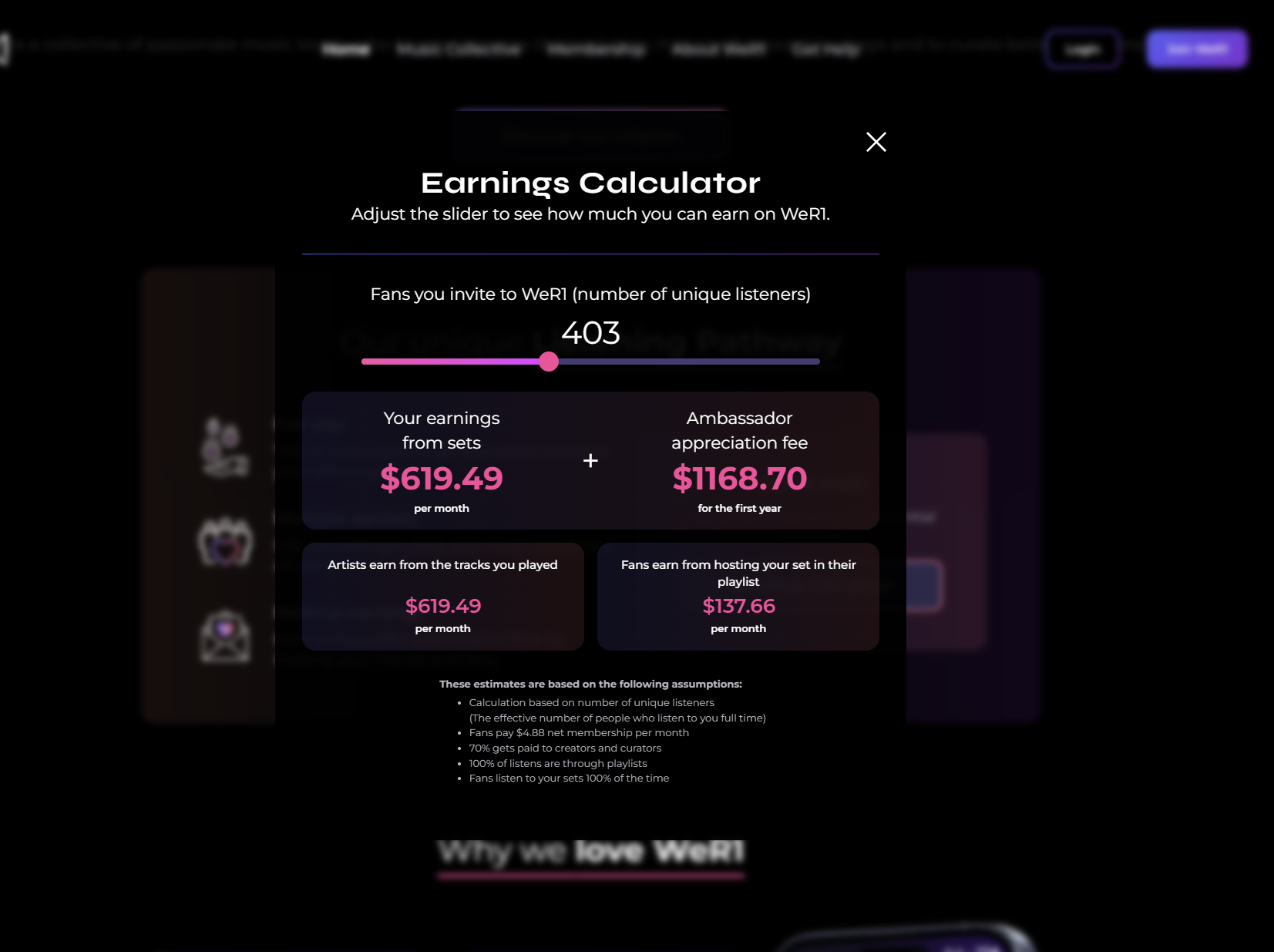
Onboarding was the biggest focus. The experience needed to reduce drop-off while making the relatively high cost of membership feel understandable and worthwhile.

Lead UI design · Web and mobile product
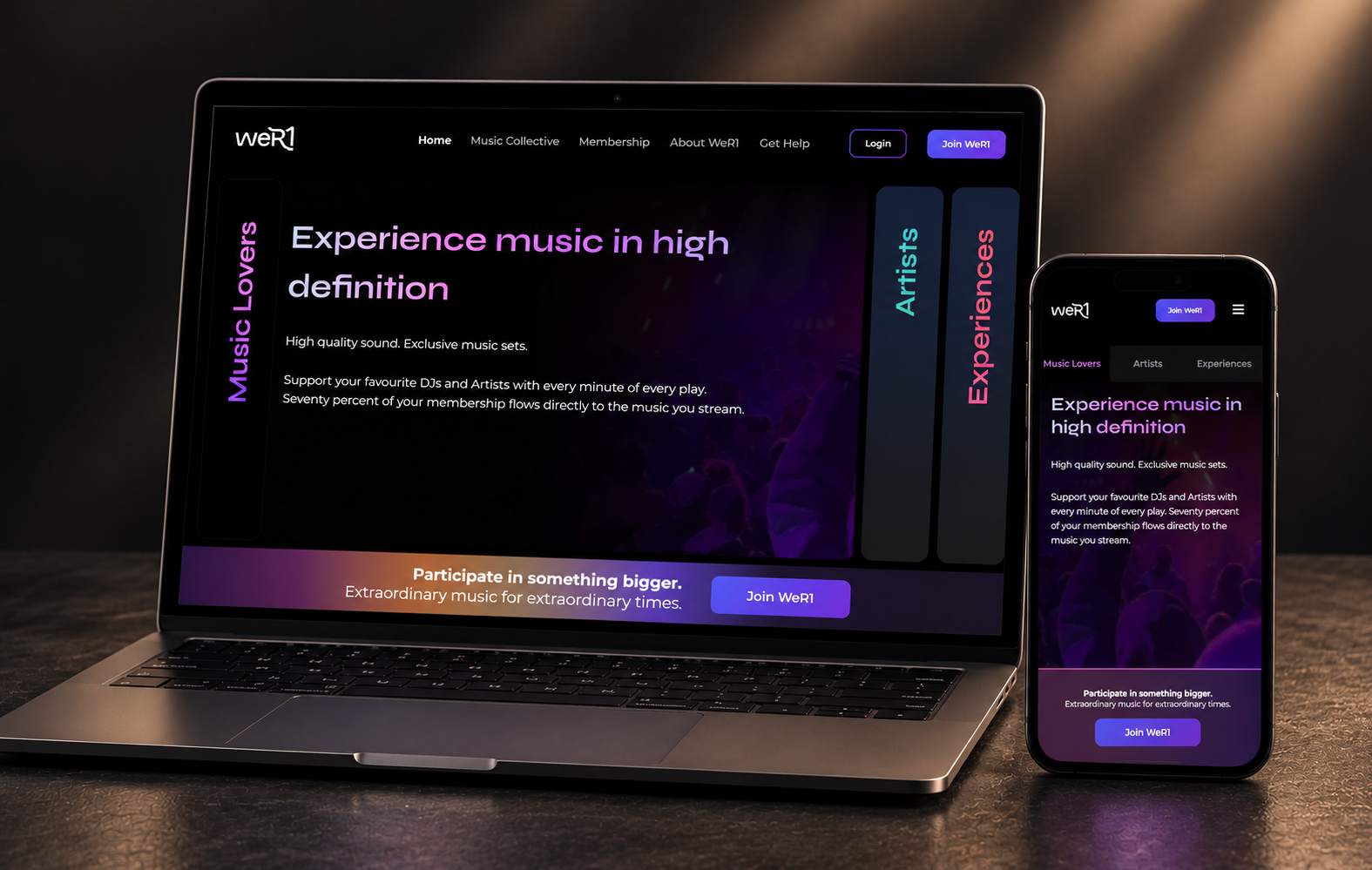
A connected product experience for a music-sharing platform, designed across listener and contributor journeys.
WeR1 brought together listeners, artists, DJs and music contributors in a product built around discovery, participation and a more transparent relationship with music.
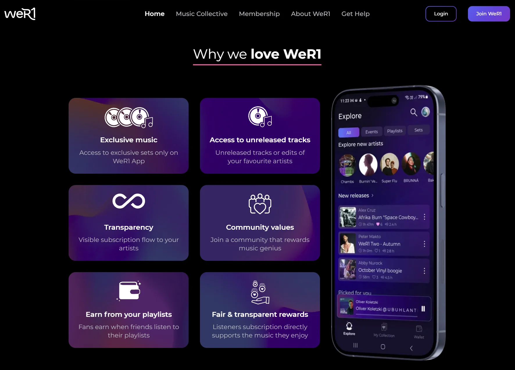
The design challenge was to make that ecosystem feel clear from the first interaction: help people understand the value of a premium membership, guide them through onboarding and give contributors the tools to upload, manage and attribute their work.
“Dimitri is a committed professional, a passionate product designer and a true pleasure to work with. During his time with us in the early stages of WeR1, he impressed us with his thoughtful approach to design. He's a skilled UX practitioner who brought valuable insights and expertise to the team.
Dimitri played a key role in designing our website, customer onboarding journey and the content exploration section of our music player app, resulting in subscriber growth and increase in early user engagement.
Beyond his design skills, Dimitri is a wonderful person with a huge heart. He's a true collaborator who fosters inspirational and supportive relationships with his colleagues.”
Onboarding was the biggest focus. The experience needed to reduce drop-off while making the relatively high cost of membership feel understandable and worthwhile.
For artists and contributors, uploading a set was a significant workflow. Track titles, attribution and the relationships between contributors needed to be clear and manageable.
Website and mobile app work had to feel like one product, even as different audiences moved through different tasks and levels of complexity.
The Figma environment became a shared working space between design and engineering: structured for development, clear enough for handoff and flexible enough for exploration.
The existing design environment had inconsistent components, defunct elements, multiple libraries, duplicated patterns and poor structure. Figma elements no longer reliably correlated with the live product.
I coordinated the consolidation and migration of those legacy systems into a more usable and connected foundation. Components, tokens, colour, typography and brand elements were brought together into pages that matched the live product, while leaving room for future exploration.